Case study
Case study
Branding, Web design
Branding, Web design
2026
2026
Livni Vibrations
Livni Vibrations
❶About
❶About
Livni Vibrations is a leading engineering firm in Israel. specializing in solutions for noise disturbances or construction damage caused by environmental or material vibrations. excelling thru their meticulous practice, efficiency, creative solutions and a strong client connection they're always looking to develop and adapt investing in innovation, technology and people.
Livni Vibrations is a leading engineering firm in Israel. specializing in solutions for noise disturbances or construction damage caused by environmental or material vibrations. excelling thru their meticulous practice, efficiency, creative solutions and a strong client connection they're always looking to develop and adapt investing in innovation, technology and people.
❷Brief
❷Brief
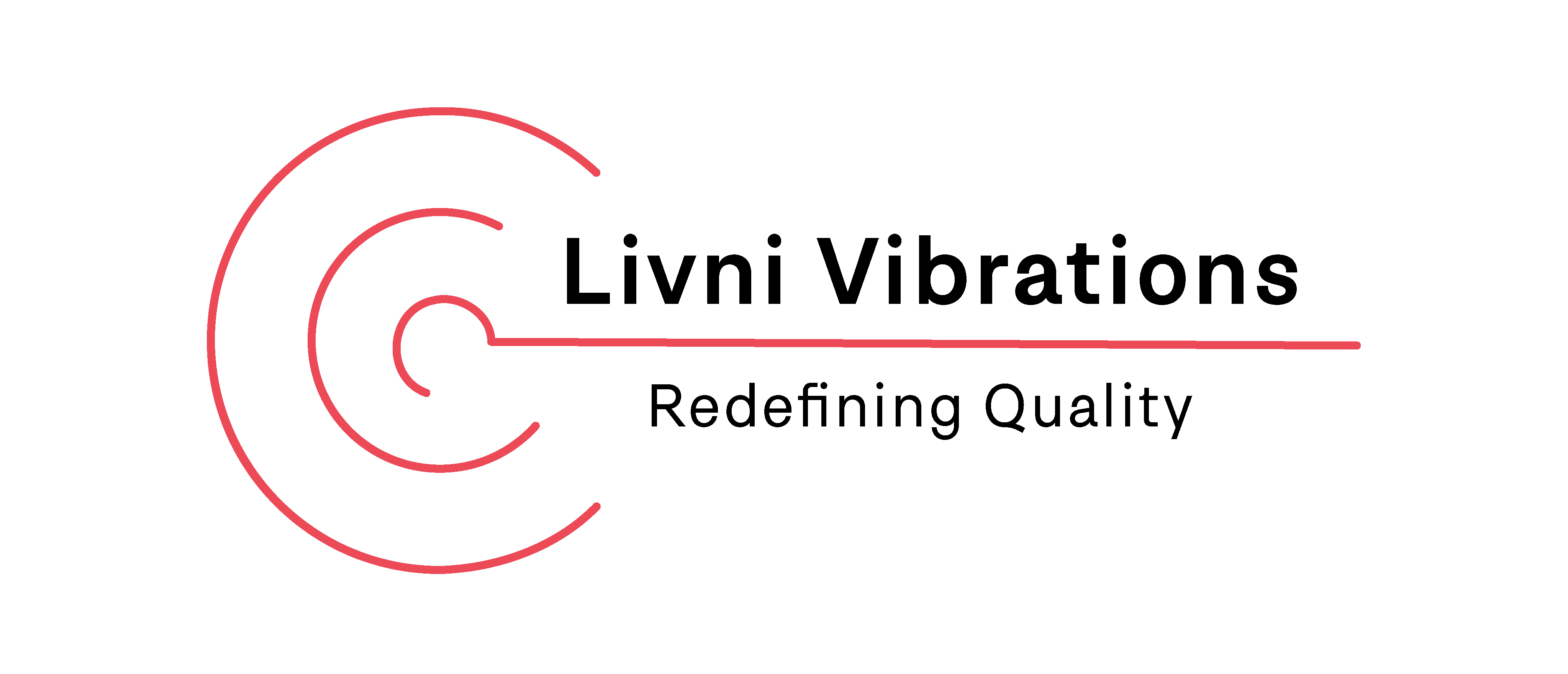
Tasked with rebranding an engineering firm specializing in acoustic solutions and vibration measurement, the goal was to develop a complete brand overhaul. The scope included creating a refreshed visual identity, designing a new logo and cohesive graphic language, and crafting a modern, functional marketing and contact website that positions the company as a trusted industry authority.
Tasked with rebranding an engineering firm specializing in acoustic solutions and vibration measurement, the goal was to develop a complete brand overhaul. The scope included creating a refreshed visual identity, designing a new logo and cohesive graphic language, and crafting a modern, functional marketing and contact website that positions the company as a trusted industry authority.

"Redefinig Quality"
"Redefinig Quality"
❸Concept
❸Concept
The brand concept revolves around forward momentum, human connection, and dynamic precision. By translating physical sound waves and structural vibrations into abstract visual metaphors, the identity balances stability with energy. Clean, assertive typography pairs with a balanced, articulate color palette—projecting technical reliability while signaling innovation and ambitious growth.
The brand concept revolves around forward momentum, human connection, and dynamic precision. By translating physical sound waves and structural vibrations into abstract visual metaphors, the identity balances stability with energy. Clean, assertive typography pairs with a balanced, articulate color palette—projecting technical reliability while signaling innovation and ambitious growth.


❹Process
❹Process
The process bridged brand strategy with technical experimentation. I developed a dynamic illustration language that abstracts vibrational forces into fluid, modern forms. Exploring tools like WebGL, Three.js, and generative AI enabled the creation of responsive, interactive elements that evoke resonance, power, and acoustic calm. Simultaneously, I established a robust typographic hierarchy and modular data-display components, turning complex engineering metrics into engaging, accessible data visualizations.
The process bridged brand strategy with technical experimentation. I developed a dynamic illustration language that abstracts vibrational forces into fluid, modern forms. Exploring tools like WebGL, Three.js, and generative AI enabled the creation of responsive, interactive elements that evoke resonance, power, and acoustic calm. Simultaneously, I established a robust typographic hierarchy and modular data-display components, turning complex engineering metrics into engaging, accessible data visualizations.
❺Design System
❺Design System
Visual Language & Assets: A dynamic graphic motif served as the foundation for custom service icons, intricate data graphs, and structural footer graphics.
Color Palette: A balanced base of clean, quiet technical grays contrasted by an energetic, high-impact red that introduces focus and drive.
Typography: Anchored by The Basics Corporate by Michal Sahar—a modern, structured, and legible typeface that conveys professional authority and structural stability across editorial and digital layouts.
Visual Language & Assets: A dynamic graphic motif served as the foundation for custom service icons, intricate data graphs, and structural footer graphics.
Color Palette: A balanced base of clean, quiet technical grays contrasted by an energetic, high-impact red that introduces focus and drive.
Typography: Anchored by The Basics Corporate by Michal Sahar—a modern, structured, and legible typeface that conveys professional authority and structural stability across editorial and digital layouts.


❻Application
❻Application
The final deliverable culminated in a scalable brand language and a fully responsive corporate website. The end result bridges high-end technical rigor with approachable, human-centric design:
Functional & Reliable: An intuitive digital experience that streamlines user inquiries, clarifies service offerings, and presents technical data with effortless clarity.
Modern & Engaging: Dynamic visual assets and interactive components that bring the science of acoustics to life, delivering an identity that feels modern, ambitious, and distinctly innovative.
The final deliverable culminated in a scalable brand language and a fully responsive corporate website. The end result bridges high-end technical rigor with approachable, human-centric design:
Functional & Reliable: An intuitive digital experience that streamlines user inquiries, clarifies service offerings, and presents technical data with effortless clarity.
Modern & Engaging: Dynamic visual assets and interactive components that bring the science of acoustics to life, delivering an identity that feels modern, ambitious, and distinctly innovative.


