Case study
Case study
Branding
Branding
2025
2025
Tozeret Publishing
Tozeret Publishing
❶About
❶About
Tozeret is an independent publishing house championing experimental, boundary-pushing literature and artistic freedom. Unbound by conventions, mainstream formats, or cultural stigmas, the imprint serves as a dedicated home for avant-garde authors, uncompromising thought, and evocative literary works.
Tozeret is an independent publishing house championing experimental, boundary-pushing literature and artistic freedom. Unbound by conventions, mainstream formats, or cultural stigmas, the imprint serves as a dedicated home for avant-garde authors, uncompromising thought, and evocative literary works.
❷Brief
❷Brief
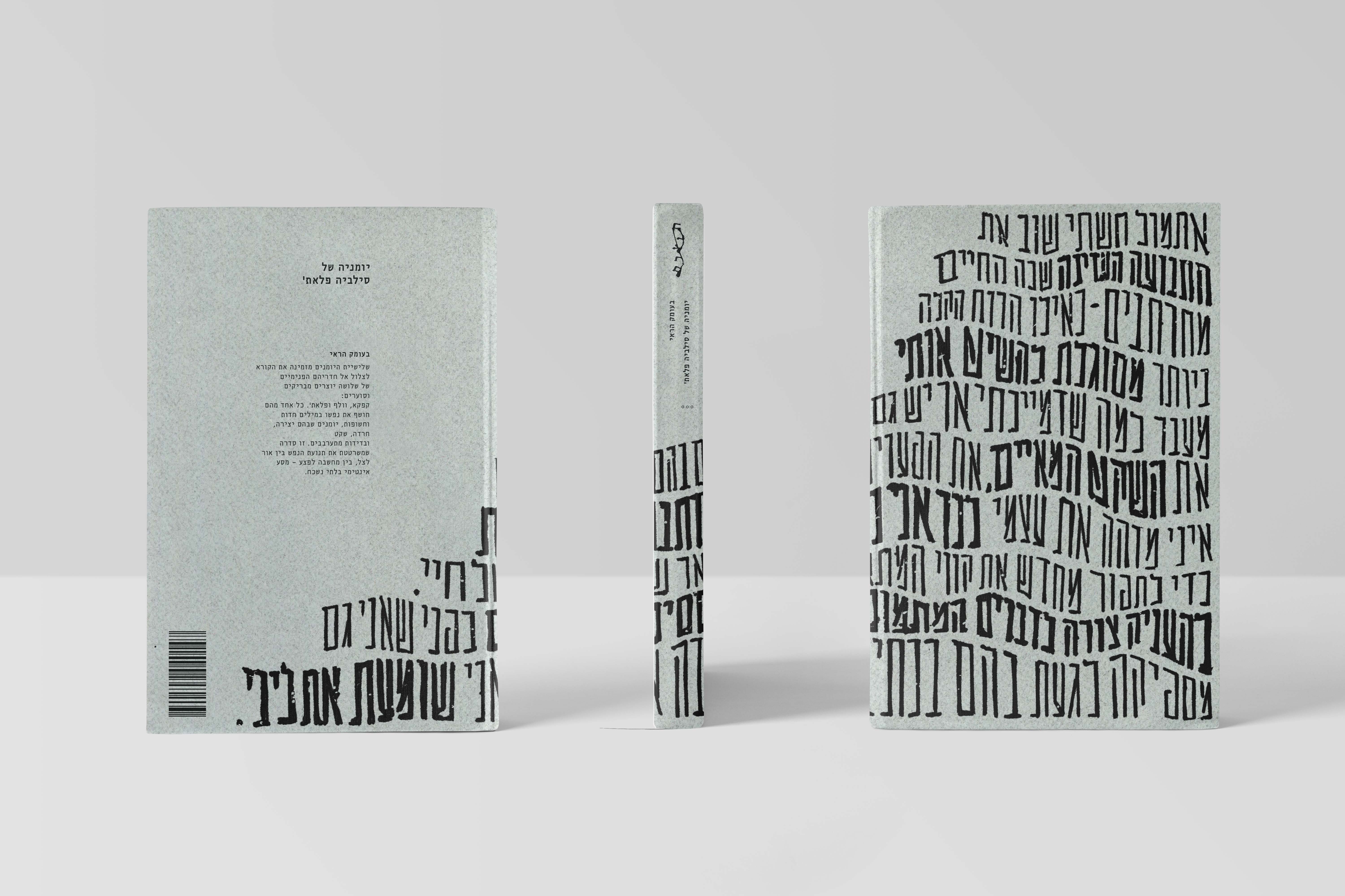
Tasked with developing a comprehensive visual identity for Tozeret, the brief encompassed creating an expressive brand logotype that embodies its radical ethos, followed by the complete cover design and packaging for a curated 3-book series. The inaugural collection features the intimate, unrestrained personal diaries of three seminal literary figures: Franz Kafka, Sylvia Plath, and Virginia Woolf.
Tasked with developing a comprehensive visual identity for Tozeret, the brief encompassed creating an expressive brand logotype that embodies its radical ethos, followed by the complete cover design and packaging for a curated 3-book series. The inaugural collection features the intimate, unrestrained personal diaries of three seminal literary figures: Franz Kafka, Sylvia Plath, and Virginia Woolf.

"Giving form to the raw mind."
“Giving form to the raw mind.”
❸Concept
❸Concept
Brand Identity: Drawing direct inspiration from the Dada and Abstract Expressionist movements, the logotype explores graphic realms of serendipity, raw emotion, tactile spontaneity, and controlled chaos.
Book Series: The concept captures the tension between raw vulnerability and creative brilliance found within personal journals. By balancing intense physical textures, somber yet magnetic color palettes, and expressive, gestural hand-lettering, the jackets communicate both psychological exposure and enduring literary power.
Brand Identity: Drawing direct inspiration from the Dada and Abstract Expressionist movements, the logotype explores graphic realms of serendipity, raw emotion, tactile spontaneity, and controlled chaos.
Book Series: The concept captures the tension between raw vulnerability and creative brilliance found within personal journals. By balancing intense physical textures, somber yet magnetic color palettes, and expressive, gestural hand-lettering, the jackets communicate both psychological exposure and enduring literary power.


❹Process
❹Process
The design process embraced tactile, analog experimentation before digital refinement:
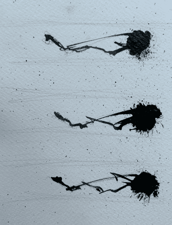
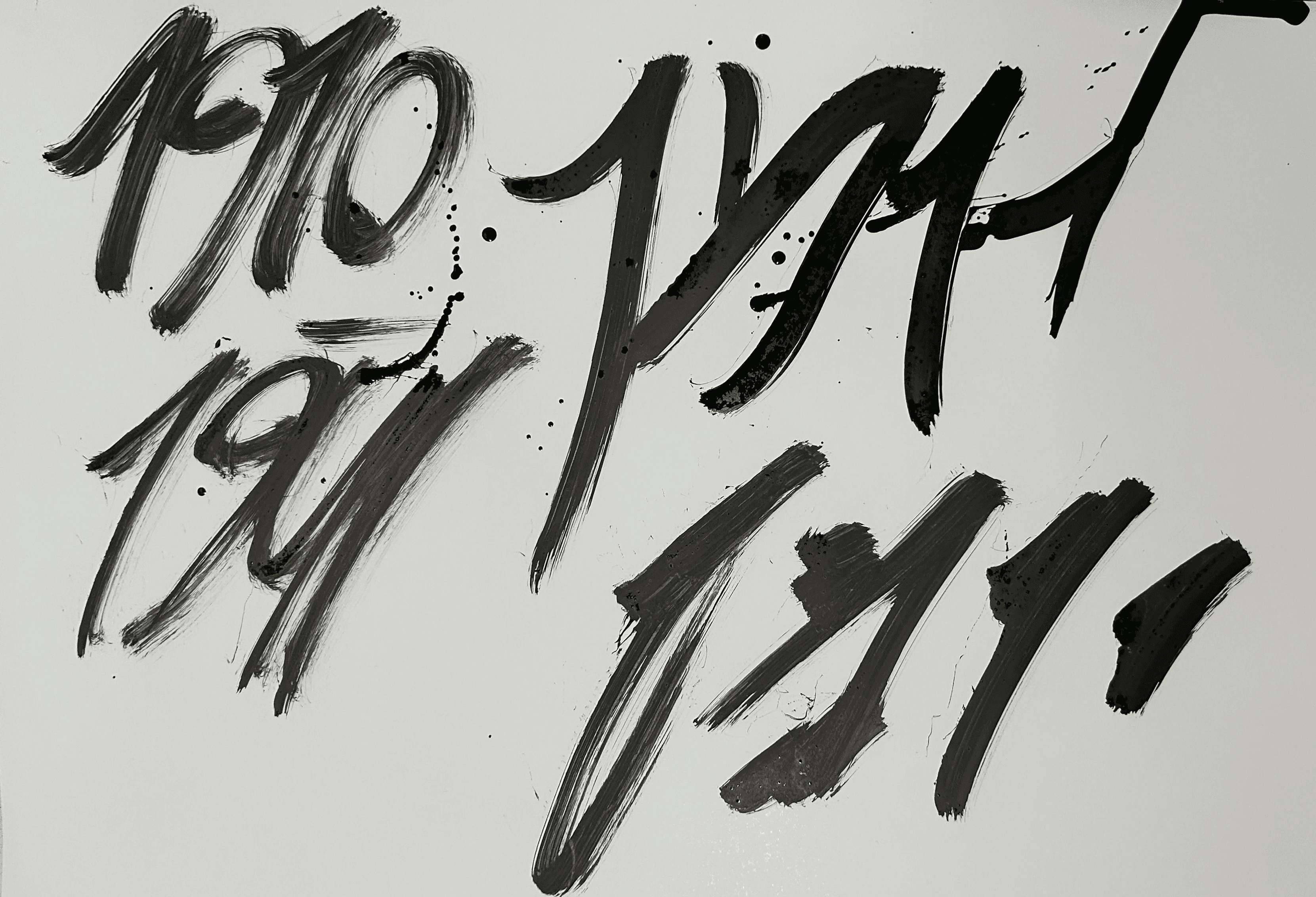
Analog Exploration: Extensive tactile studies utilizing ink splatters, charcoal washes, gouache textures, and mixed-media collaging to discover spontaneous silhouettes, subsequently digitized and harmonized for clean legibility.
Typographic Narrative & Grids: For each title, an evocative, pivotal excerpt from the author's diary was transcribed by hand into an evolving layout grid. Each grid shifts structurally across the series, imbuing each book with its own distinct rhythm, emotional tempo, and individual personality.
The design process embraced tactile, analog experimentation before digital refinement:
Analog Exploration: Extensive tactile studies utilizing ink splatters, charcoal washes, gouache textures, and mixed-media collaging to discover spontaneous silhouettes, subsequently digitized and harmonized for clean legibility.
Typographic Narrative & Grids: For each title, an evocative, pivotal excerpt from the author's diary was transcribed by hand into an evolving layout grid. Each grid shifts structurally across the series, imbuing each book with its own distinct rhythm, emotional tempo, and individual personality.

❺Design System
❺Design System
Logotype Structure: Marries the stately, literary presence of the classic Hebrew typeface Hadassah with an organic, gestural ink-blot form. The ink shape organically dictates the height, rhythm, and baseline shifts of the letterforms, bridging classical authority with spontaneous freedom.
Editorial Typography: Paired with Henri Friedlaender’s Arbel, introducing an understated, typewriter-like texture reminiscent of intimate diary entries and personal correspondence.
Print & Materiality: Printed on textured, unbleached Canson corn-grain papers, reinforcing the physical, tactile, and unfiltered essence of archival manuscripts.
Logotype Structure: Marries the stately, literary presence of the classic Hebrew typeface Hadassah with an organic, gestural ink-blot form. The ink shape organically dictates the height, rhythm, and baseline shifts of the letterforms, bridging classical authority with spontaneous freedom.
Editorial Typography: Paired with Henri Friedlaender’s Arbel, introducing an understated, typewriter-like texture reminiscent of intimate diary entries and personal correspondence.
Print & Materiality: Printed on textured, unbleached Canson corn-grain papers, reinforcing the physical, tactile, and unfiltered essence of archival manuscripts.
❻Application
❻Application
The resulting collection functions as both literary artifact and visual art piece:
Tactile Resonance: The combination of raw paper texture, bespoke calligraphic wraparounds, and dark, brooding palettes creates an immediate, intimate connection with the reader.
Holistic Cohesion: While each cover maintains a distinct voice and tailored grid reflecting its respective author, the trio shares a unified material, typographic, and conceptual foundation on the shelf.
The resulting collection functions as both literary artifact and visual art piece:
Tactile Resonance: The combination of raw paper texture, bespoke calligraphic wraparounds, and dark, brooding palettes creates an immediate, intimate connection with the reader.
Holistic Cohesion: While each cover maintains a distinct voice and tailored grid reflecting its respective author, the trio shares a unified material, typographic, and conceptual foundation on the shelf.