Case study
Case study
Branding, Web design
Branding, Web design
2026
2026
Prisoners Museum
U.P Museum
❶About
❶About
The Museum of Underground Prisoners in Jerusalem is a historic site operating inside a former Russian pilgrim hostel that the British Mandate converted into a central high-security prison. As an official municipal museum holding intertwined layers of colonial history, resistance, and incarceration, it embodies the memory of Jewish, Arab, and Christian prisoners held within its thick stone walls.
The Museum of Underground Prisoners in Jerusalem is a historic site operating inside a former Russian pilgrim hostel that the British Mandate converted into a central high-security prison. As an official municipal museum holding intertwined layers of colonial history, resistance, and incarceration, it embodies the memory of Jewish, Arab, and Christian prisoners held within its thick stone walls.
❷Brief
❷Brief
Tasked with rebranding the museum, the scope encompassed:
Designing a contemporary logo and core visual identity reflecting the building's physical architecture and historical weight.
Creating a promotional print campaign, including re-opening posters and special "White Night" event collateral.
Developing a dynamic motion poster for digital transit displays and social media.
Tasked with rebranding the museum, the scope encompassed:
Designing a contemporary logo and core visual identity reflecting the building’s physical architecture and historical weight.
Creating a promotional print campaign, including re-opening posters and special “White Night” event collateral.
Developing a dynamic motion poster for digital transit displays and social media.

"Layers of history and resistance"
“Layers of history and resistance”
❸Concept
❸Concept
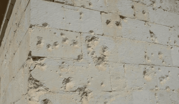
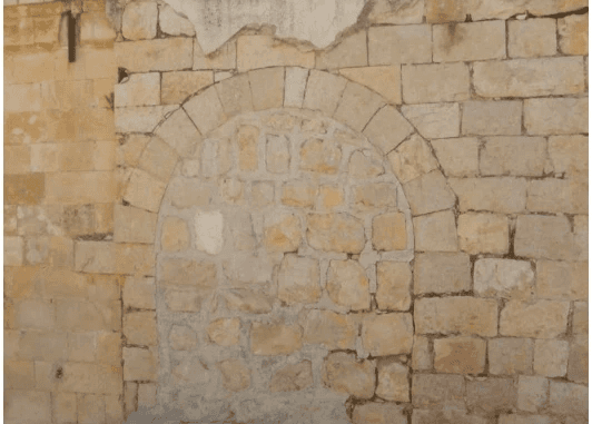
Rooted in on-site field research—documenting the physical stones, rusted bars, harsh architectural grids, and worn surfaces—the concept centers on layers of struggle, resilience, and trilingual parity. Rather than glossing over the prison's stark reality, the visual identity translates systemic confinement and human resistance into textured, overlapping layers and raw graphic contrast.
Rooted in on-site field research—documenting the physical stones, rusted bars, harsh architectural grids, and worn surfaces—the concept centers on layers of struggle, resilience, and trilingual parity. Rather than glossing over the prison's stark reality, the visual identity translates systemic confinement and human resistance into textured, overlapping layers and raw graphic contrast.


❹Process
❹Process
Analog Distressing & Collage: Printed initial typographic layouts on rough paper using high-contrast Xerox machines, then tore, glued, layered, and rescanned the compositions to build physical depth and grit.
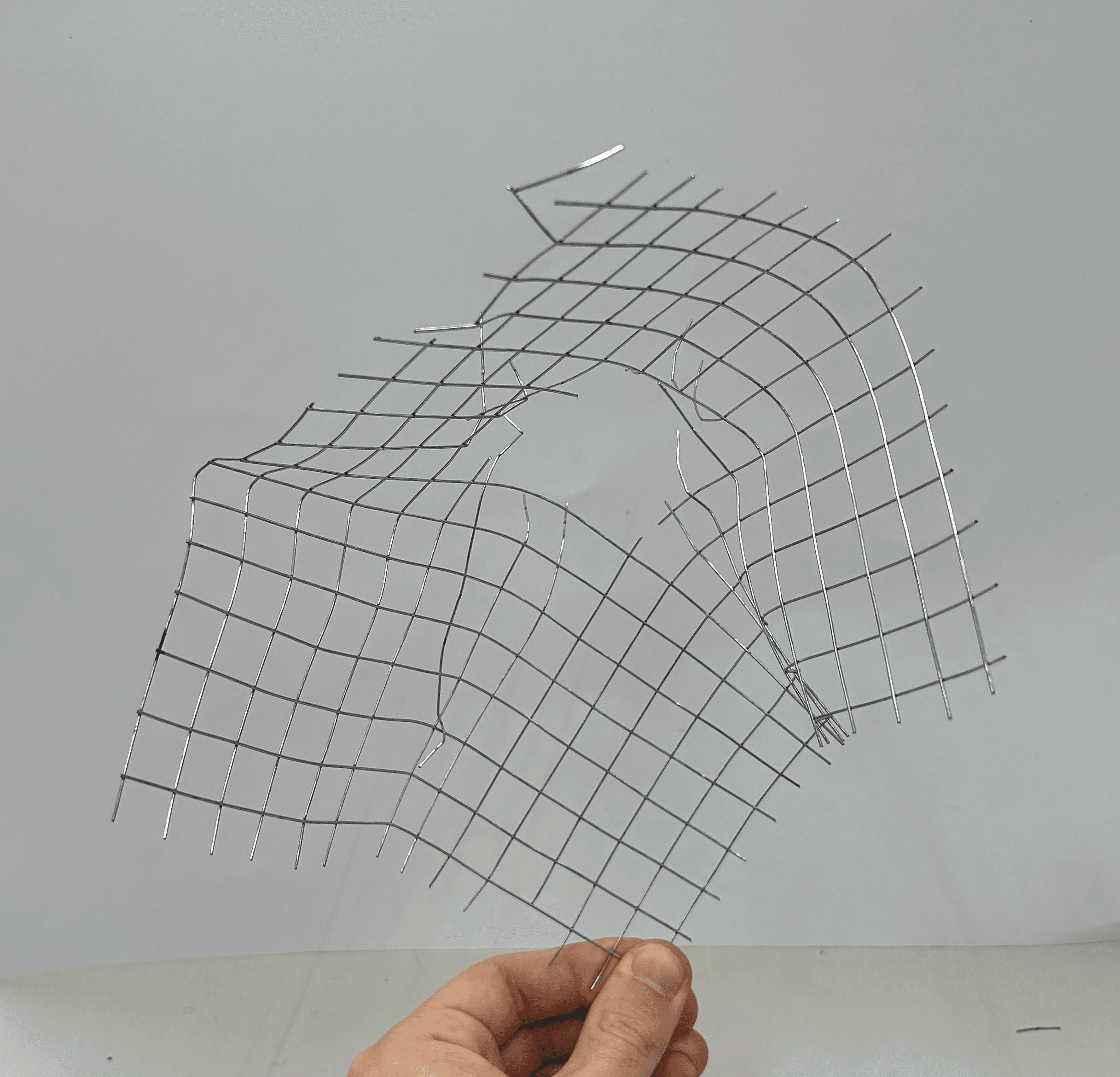
Graphic Abstraction of Breach: Developed an expressive illustration motif inspired by breached fences and jagged barbed wire, capturing the friction of confinement.
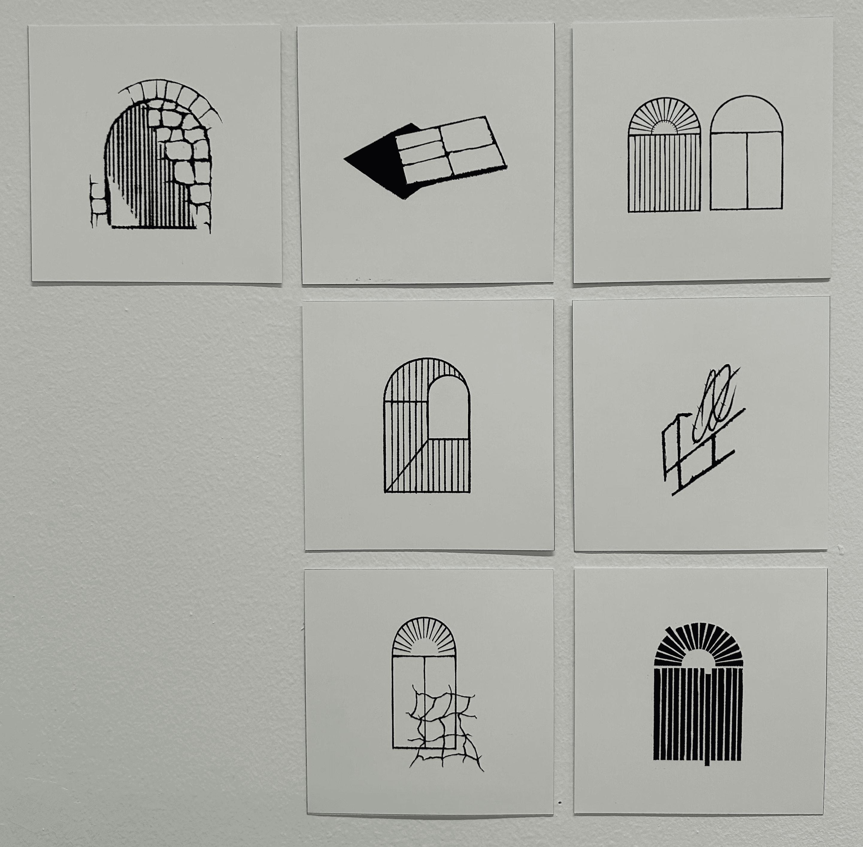
Form & Shadow Exploration: Distilled architectural elements into geometric marks through tactile line work and spatial reduction.
Analog Distressing & Collage: Printed initial typographic layouts on rough paper using high-contrast Xerox machines, then tore, glued, layered, and rescanned the compositions to build physical depth and grit.
Graphic Abstraction of Breach: Developed an expressive illustration motif inspired by breached fences and jagged barbed wire, capturing the friction of confinement.
Form & Shadow Exploration: Distilled architectural elements into geometric marks through tactile line work and spatial reduction.
❺Design System
❺Design System
The Logo: Abstracts the arched silhouette of colonial prison cell windows and heavy iron doors, capturing the perspective of light cutting into a dark cell—a visual metaphor for hope and historical emergence.
Trilingual Typographic Balance: Set in Abraham by Daniel Grumer in a heavy weight. Its shared, unweighted design across Hebrew, Arabic, and Latin grants equal visual and cultural status to all three scripts.
Color & Surface: Relies on monochromatic newsprint, stark blacks, kraft cardstock tones, and raw paper textures, mirroring the stone walls and archival documentation of the compound.
The Logo: Abstracts the arched silhouette of colonial prison cell windows and heavy iron doors, capturing the perspective of light cutting into a dark cell—a visual metaphor for hope and historical emergence.
Trilingual Typographic Balance: Set in Abraham by Daniel Grumer in a heavy weight. Its shared, unweighted design across Hebrew, Arabic, and Latin grants equal visual and cultural status to all three scripts.
Color & Surface: Relies on monochromatic newsprint, stark blacks, kraft cardstock tones, and raw paper textures, mirroring the stone walls and archival documentation of the compound.


❻Application
❻Application
Outdoor Signage: Architectural exterior signage framing the clean geometric logo against historic stone facades.
Event & Re-Opening Posters: Large-format print series pairing coarse paper textures and torn Xerox layers with balanced trilingual event details.
Dynamic Motion Posters: Digital screen takeovers that cycle between dense, glitching historical layers and the clean, structured poster grid to capture the transition from imprisonment to living memory.
Outdoor Signage: Architectural exterior signage framing the clean geometric logo against historic stone facades.
Event & Re-Opening Posters: Large-format print series pairing coarse paper textures and torn Xerox layers with balanced trilingual event details.
Dynamic Motion Posters: Digital screen takeovers that cycle between dense, glitching historical layers and the clean, structured poster grid to capture the transition from imprisonment to living memory.

